
The series in the Service Design Breakfast (#SDA15) continued with an exciting topic on November 5th, when OP-Pohjola, the largest national bank in Finland, and design company Nordkapp presented how they designed and developed the Mobile Wallet Pivo – one of the most successful banking applications in Finland.

What is Pivo?
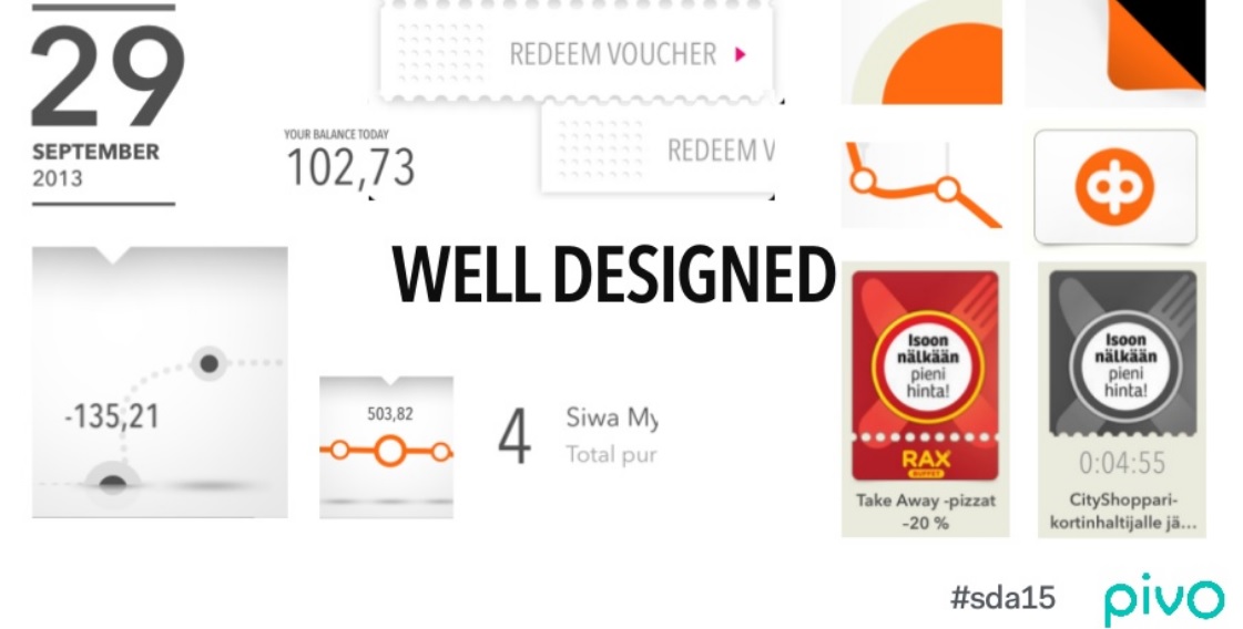
Pivo is a digital wallet application for smart phones. With an intuitive and simple UI, it offers an easy way for customers to glance at their account balance, while simultaneously viewing their purchase history and an estimate for future spending based on their buying habits. It helps customers to be in control of their daily spending and to know what they can afford. Pivo has also integrated loyalty programs into the service offering, such as PINS and Cityshoppari, enabling the customer to find offers and coupons based on their interest and location. Thus, Pivo is a platform for mobile payments, focusing on the purchase moment, before and after the actual payment. The aim has been to develop one common brand for other partners and banks to build on.
Continuous feedback from the customers
A Lean UX design process was used to develop Pivo Wallet, with the continuous circle of thinking, iterating and measuring. Customers have been involved throughout the entire design process. Actually they were involved already before the concrete concept was defined. Feedback was asked from customers based on a vague idea using a video prototype communicating the concept thinking. A lot of qualitative and quantitative user research was made already in the beginning of the process. The hypotheses were validated with interviews, demos, usability tests as well as private alpha and public beta tests. Pivo also has an active user base providing continuous feedback and improvement ideas via Facebook, Twitter and email.

The UI is the actual product
The design process had an articulated vision from the beginning. Mood boards were used to capture the visual look and feel for clean, minimalistic and modern UI. The goal was to do one thing well. It was interesting to hear that inspiration and analogies were searched from other mobile applications that usually have excellent UIs, such as weather applications.
There were four elements chosen as design attributes for the UI development:
- Well designed (simple, minimalistic, modern)
- Human (e.g. personalized greetings)
- Intelligent (e.g. estimate the future spending)
- Credible (reliability for a bank application)
Pivo Wallet has been very successful. Since its launch in May 2013 there has been over 350 000 downloads. 33% of the users open Pivo every day and 66% on a weekly basis. The average rating for Pivo Wallet in iTunes app store is 4,5/5. Pivo Wallet also won a Reddot Award for communication design in 2014.
More information about the Pivo #SDA15 presentation can be found at Slideshare and Pivo Wallet website.
Susanna Turunen, Laurea SID 2014 student

Leave a comment