

The New York University (NYU) students I referred to in my last blog post about virtual work were asked to prepare a 1-minute video to communicate their ideas for the next class. There are so many ways to visualize projects and their components that I can only just begin to grasp the subject in this post. I will now introduce 3D printing and share four data visualization tips from our Design Lead. Nevertheless, I hope this article gives you some interesting ideas to visualize different types of data and processes.
3D printing for prototyping
I guess I had heard about 3D printing before but I didn’t really recognize what it was until here in New York. While preparing a post for our blog I was browsing through our photo database and came across a photo of Chris (Fabian, UNICEF Innovation Unit Co-Lead) throwing in a 3D-printed item he had received from Singularity University up in the air. From that point on I wanted to see a 3D printer because it seemed more like a tool from science fiction movies than a machine invented in the 1980’s. Later on I learned that 3D printers come in many different shapes and sizes.

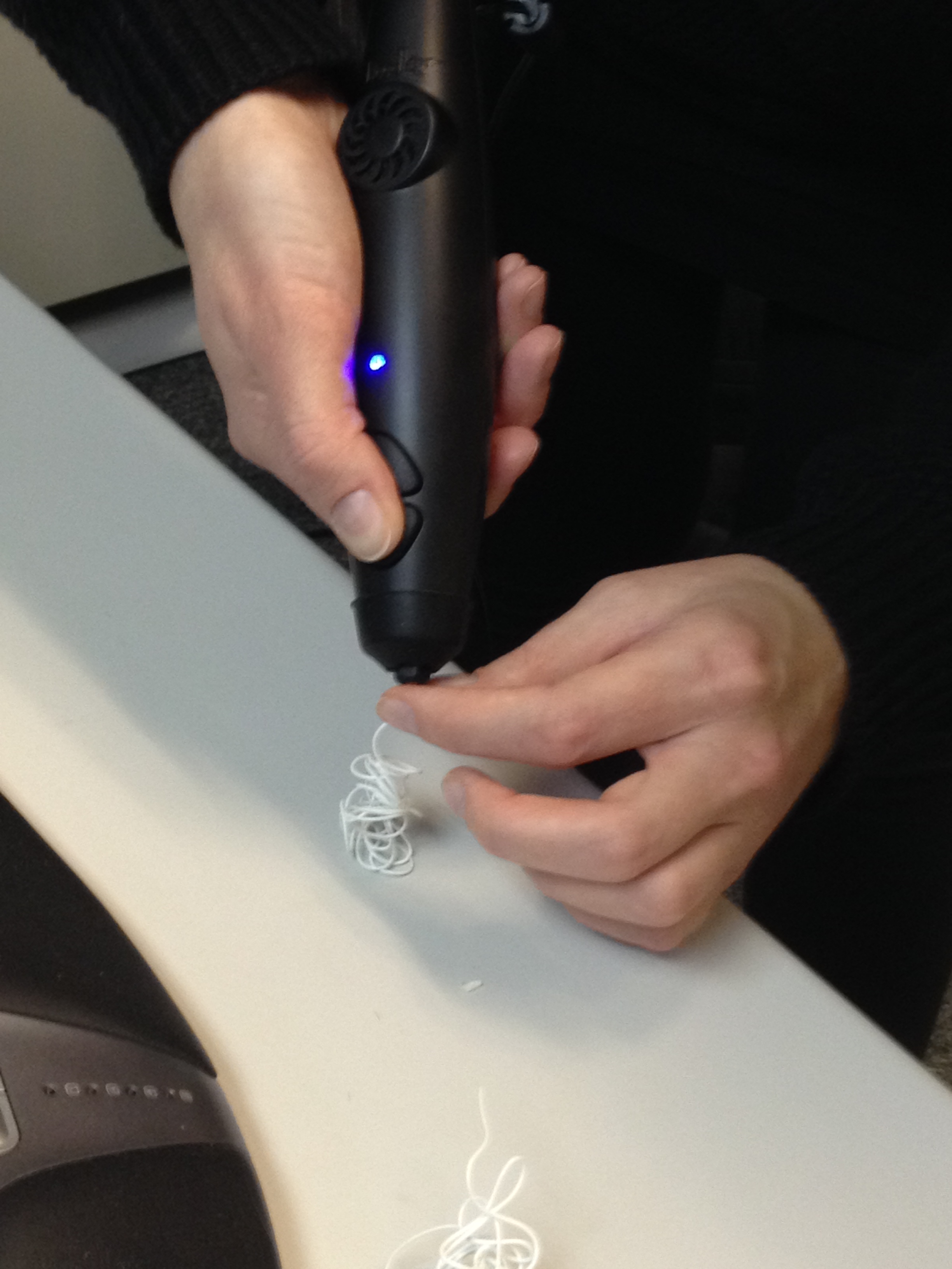
From what I know, 3D printing is used at least in our Innovation Lab in Uganda. Also, the Design for UNICEF student team developing modular drones have used 3D printing within their design process. Recently, we got a 3D printer to the New York office: the 3Doodler. Some team members tested it and made cool Christmas trees. All I was able to make was a weird white ball of string (it was supposed to be a snowman). I guess it’s a good tool after some practice.

One of my motivators for going to the NYU class I mentioned in the last post of this series – besides that I wanted to see the class and learn more about our co-operation with academia – was to see a 3D printer live as I heard they had one. At this point we didn’t have the 3Doodler yet. The next day I had the opportunity to see another one at Brooklyn Research (more about Brooklyn Research in the post 2/5).

What was surprising was that both were so different – the one at NYU was a table model Maker-Bot, very small and modern looking, and the one at Brooklyn Research much bigger and industrial and looked more like a refrigerator. Anyway, I was glad to see how a 3D printer works and seeing that, I warmly recommend my school to get one (if they don’t already have), as it is an excellent tool for prototyping.
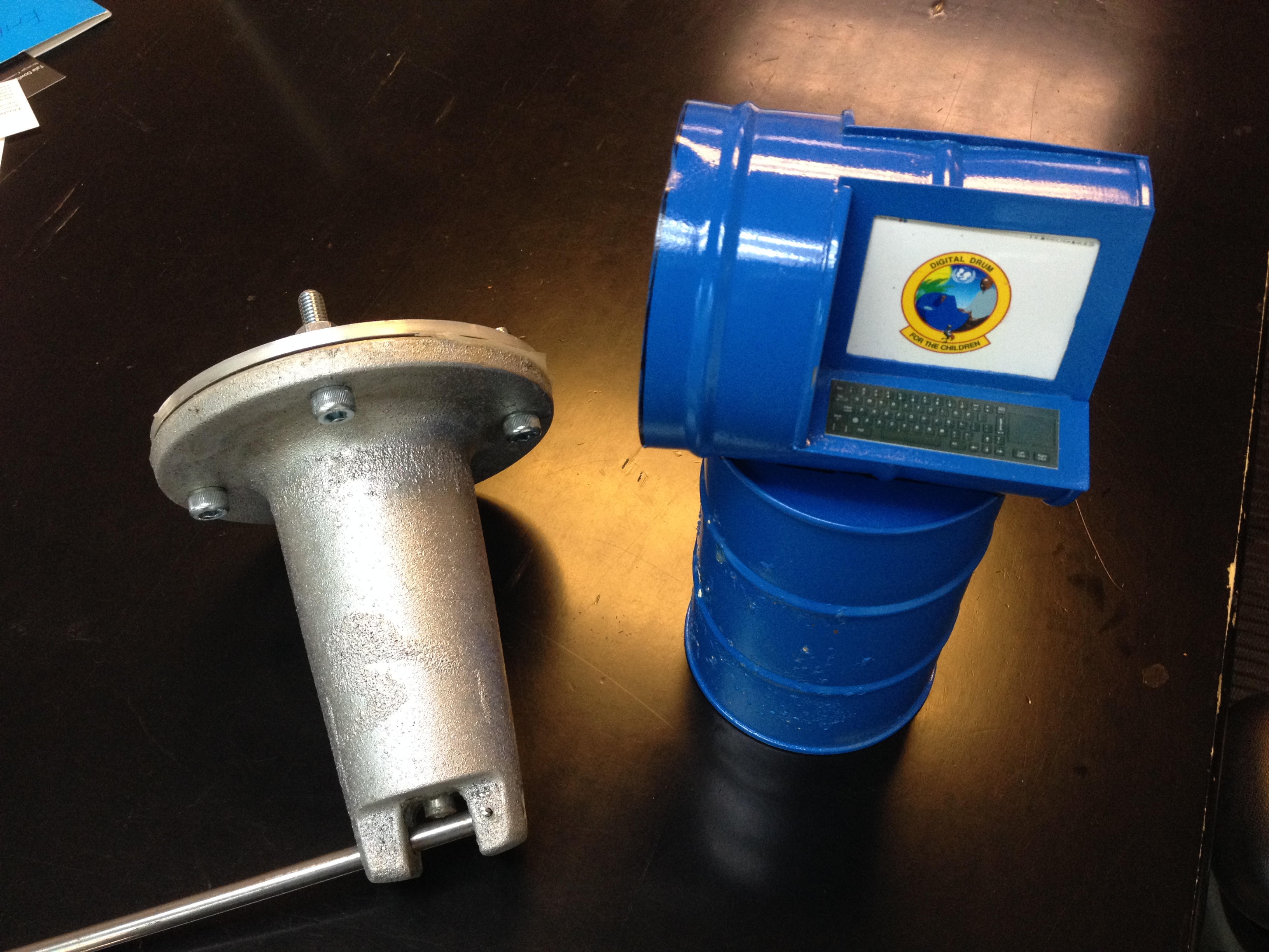
Besides Chris’ 3D printed item and our little Christmas trees (and my weird white ball) we also have other prototypes here at the office. For example, there is a small Digital Drum on the bookshelf next to me, and a life sized one in the corner not that far from where I sit. I recommend reading also about service prototyping – how our country office in Nicaragua is using prototyping to develop birth registration services.
Four data visualization tips from an expert
As they say a picture can be worth more than a thousand words. Besides visualizing ideas with tools like prototyping, white boards and sticky notes we also visualize data with computer programs to illustrate concepts, flows, connections and big masses of data. Mini, our Design Lead and expert in data visualization, uses various specified tools in her work. She shared her favorites with me to pass along to you, including a short description of why she likes these tools.
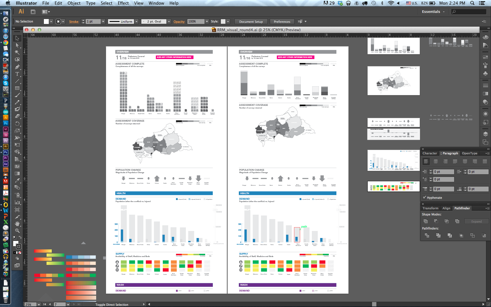
1. Adobe Illustrator:
“Illustrator is great when you are creating logos, icons or diagrams. It is a good tool for creating shapes that can be resized without being pixelated or distorted.”
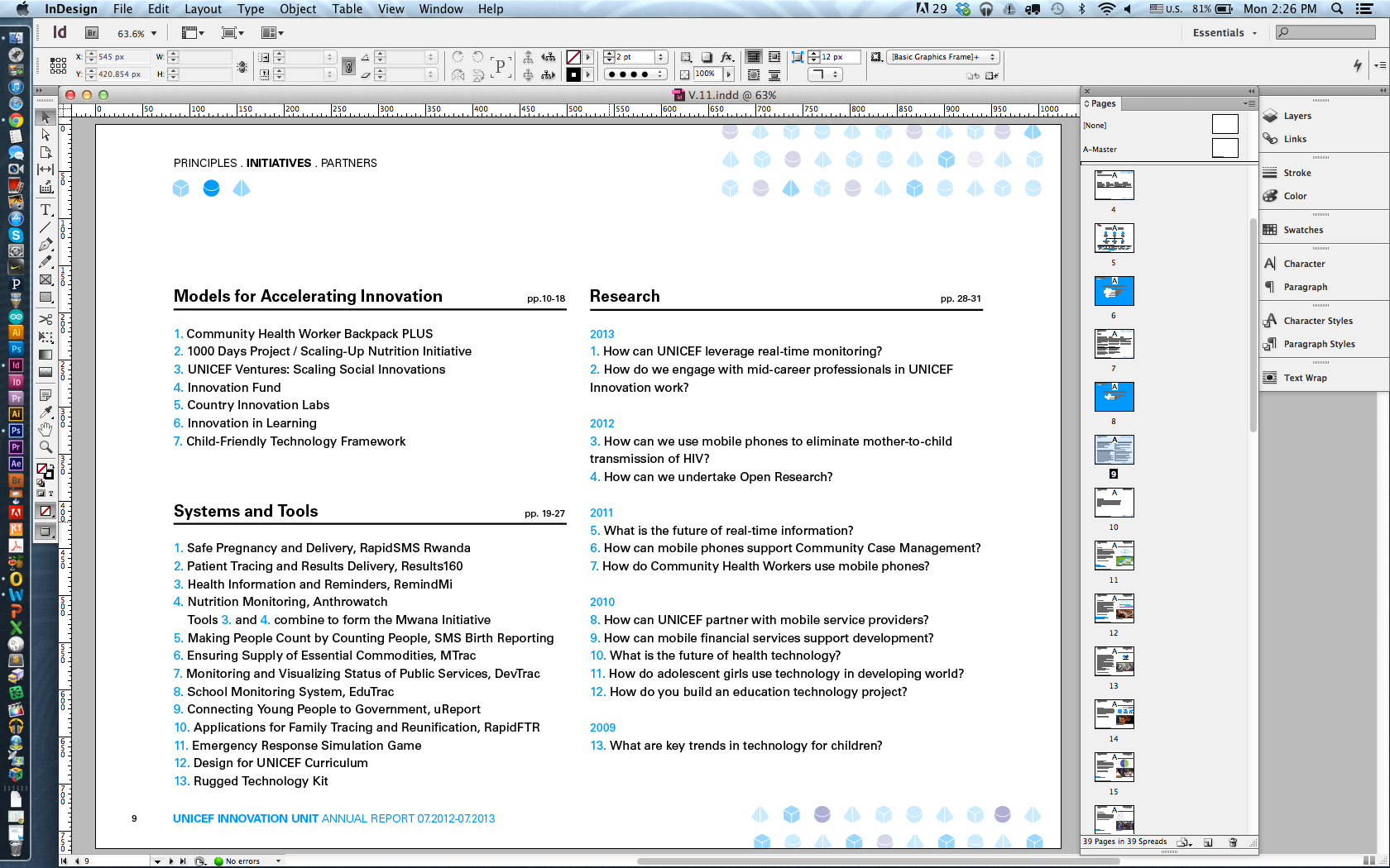
2. Adobe InDesign:
“InDesign is used to create books and layouts. It allows delicate control over typography, more control than with Microsoft Word. You can move each letter and paragraph to the exact place you want. You can also set styles for paragraphs and characters that you can apply to the whole document.”
3. Adobe Photoshop:
“Photoshop is great for manipulating images and moving pixels. It is also often used to build a visual look or mock-up of a website or software. I can use Photoshop to create a website mock up from the existing screen grabs.”

4. Omnigraffle:
“Omnigraffle is good for creating a quick mock-up. It has a stenciled web part that could be used to create wireframe and it is also good for creating flow charts and organizational charts. This software is for a Mac OS. People with a PC often use Microsoft Visio.”

My next and last blog post about the design tools our team uses in our everyday work will discuss user-centric methods that represent one of the main principles behind our innovation work – co-designing products, services and processes for and more importantly with the end user so that the solutions have real life impact and are feasible in the user’s own context and environment.
Erika Pursiainen
Innovation Unit, UNICEF NYHQ
epursiainen(at)unicef.org
Read more stories of UNICEF Innovation on our blog http://www.unicefstories.org.
Read also my previous posts:
Behind the scenes – Tools in innovation designers’ sandbox Part 3/5
Behind the scenes – Tools in innovation designers’ sandbox Part 2/5
Behind the scenes – Tools in innovation designers’ sandbox Part 1/5

Leave a comment