
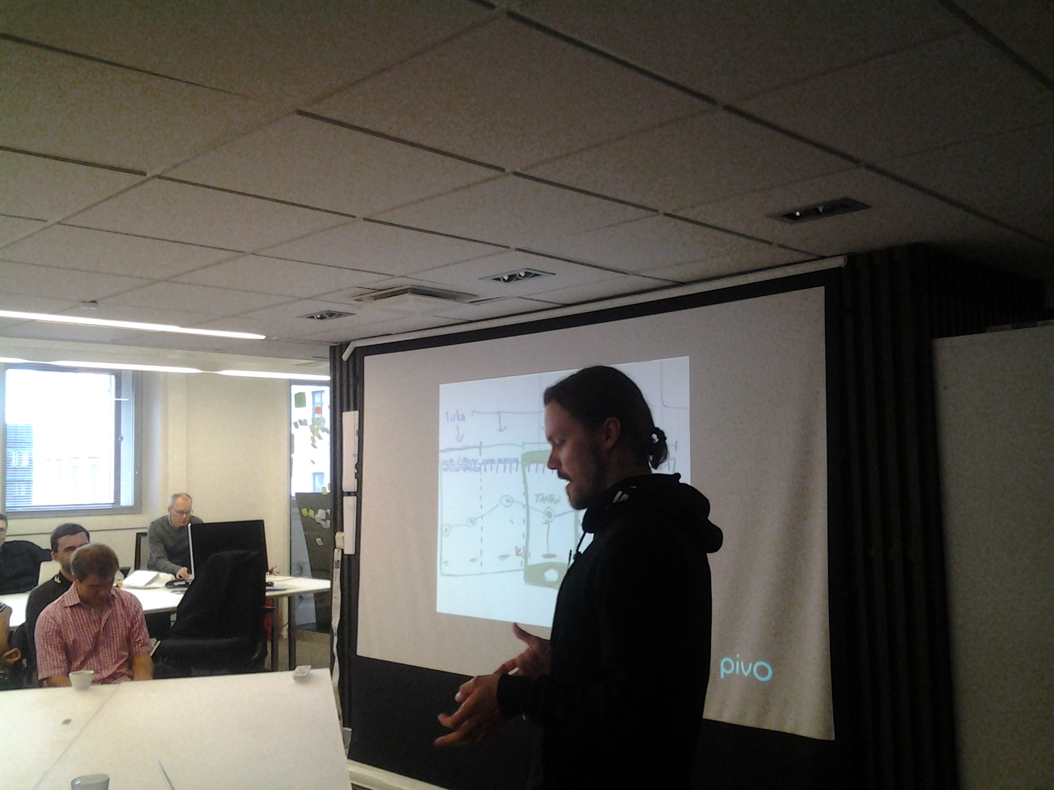
Pivo is not a mobile Czech application for finding good beer, it’s an internationally acclaimed Finnish mobile system for tracking and predicting one’s personal finances. It is also a contender for the #sda15. Built around a graph, the systems shows the user’s expenditures and works as a reminder of what exactly is spent and where. Two things set it apart from your typical mobile bank app: its focus, and the elegant design.

Basically, the user interface is the product itself. As simple as possible, the design plan has from the start sought to create something that only does one thing, and does it well. In one graph, it shows what the designers – OP, Nordkapp and their associates – though most important when a customer looks at his or her (now virtual) wallet’s contents: “Am I f*ed?” Also, it gives insight into more long-term customer needs such as “Can I afford this?”.
Excluding the fact that the plan went design-first (“let’s use a graph!”) from the initial idea, the whole story of Pivo is like a textbook example on lean design. Initially envisioned by the mobile services unit of OP in Oulu and then executed with the internet services focused design agency, Nordkapp, it has obviously benefited from start-up like creative freedom that is rare in companies like older banks. Finding out that mobile payments are the easy part, the innovators focused on the processes around them, especially personal tracking.
Staying true to the core idea, the companies did several rounds of interviews, with probing and testing in the mix, iterating all the way. The sole time something was changed without user feedback, things did not go well at all, so it’s a clear argument for gathering user insight at all times. This still continues, as users keep sending feedback through both email and social media. Within its four clear themes – well designed, human, intelligent and credible – the app is efficient, easy to use yet bank-like enough to inspire trust, shows its logics for a user who wants to know more, and smooth: the graph is informative, yet soft, so that it is pleasing to the eye rather than mathematically sharp.
Pivo (a name suggested by N2 after several others were tried) was made into a brand by itself, rather than an extension of the OP-Pohjola group, so that it could be linked to other companies as well. For the same reason, it is easy to customize for brand linking. It has so far been downloaded over 350.000 times. I am downloading it immediately myself, should my own bank choose to take it into use.

Leave a comment